Available Functions
Across all widgets and subordinated dashboards of the application scenarios
"Design & Document"
"Control & Release"
"Read & Explore"
the following functions are available:
Open/Edit Elements
Open a model in the graphical editor by clicking its linked name. The only exception to this are Business Process Diagrams, which are opened in the textual view in the "Read & Explore" scenario.
Open the Notebook of an object by clicking its linked name.
Open a task by clicking it.
Show or hide an element in a chart by clicking its name.
Switch to the detailed view of a widget via the icon
 .
.Confirm the data actuality of an object via the icon
 .
.Open an Insights dashboard by clicking the icon
 .
.Hover over a list item to reveal icons for editing that item (e.g.
to open an Insights dashboard).
The time period after which an object is marked as 'yellow' or 'red' if its data actuality was not confirmed by the responsible depends on the configuration of your ADONIS NP installation.
Create Views
Create a Matrix View on a model or on one or more objects via the icon
 .
.Create a Gantt View on a model or on one or more objects via the icon
 .
.Create a Portfolio View on one or more objects via the icon
 .
.Create a BIA View on one or more objects via the icon
 .
.
Create Reports
Create an Open Questions Report via the icon
 .
.Create a Standard Report via the icon
 .
.Create a QM Report via the icon
 .
.
General Tools
Export the content of a widget as a PDF file or Excel file (XLSX format) via the icon
 .
.Refresh a widget via the icon
 .
.Open a "Management Dashboard" which contains detailed information regarding your models via the icon
 .
.
Interactive Pie Charts
Select the corresponding items in the appropriate list by clicking a segment.
Open a separate page which lists the corresponding items by double-clicking a segment.
Filter Data in Columns
Filter data in columns to show the elements you want and hide the rest. Once you have filtered elements in a column, you can either apply additional filters, or clear all filters to redisplay all elements.
Apply Filter
To apply a filter to a column:
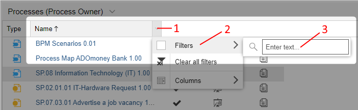
The button
 is activated in the
header of any column by mouseover. Click this button to open a drop-down menu (1).
is activated in the
header of any column by mouseover. Click this button to open a drop-down menu (1).Point to Filters (2), and then use the provided filter (3). The type of filter available depends on the column’s contents:
Filter by text: In the Enter Text box, type the text you want to search for. This type of filter is available in columns with text content like Name or Description.
Filter by values: Select the values you want to show from the list. This type of filter is available in columns like Type or State (that is, columns with content from a predefined range of values).
Filter by date: Point to one of the operators Before, After or On, and then choose a date. This type of filter is available in columns like Date.
Filter by number: Select one of the operators Equals (
=), Greater (>) or Smaller (<), and then enter a number. This type of filter is available in columns like Value at risk.
When a filter is applied, the button
 will appear in the column header.
It replaces the button .
will appear in the column header.
It replaces the button .
Remove or Reapply a Filter
To remove (or reapply) a filter from a column:
- Click the button in the header
of any column, and then click Filters. This command is a toggle. You click it to remove the
filter (check mark will be cleared), and you click it again to reapply the filter (the check
mark will be selected).
Remove all Filters in a Widget
To remove all filters in a widget:
- Click the button in the header
of any column, and then click Clear all filters.