Working with Charts
Charts enable you to visualise objects and their attributes and relations in ADONIS. Large amounts of data are clearly displayed graphically and can be understood more easily.
Types of Charts
There are four types of charts in ADONIS:
Analysis: Dataset and Charts Combined
In ADONIS, you do not just create a chart, you create a comprehensive analysis. An analysis consists of a set of data and selected charts for visualisation. This means that you can easily create multiple charts from one data set. You can save an analysis for future use and even share it with your colleagues.
Create Beautiful Charts
It's easy to create attractive charts in ADONIS. Here is what you need to do:
Start by creating a new analysis.
Go to
 Analyse and
create a new analysis.
Analyse and
create a new analysis.Define the dataset. You can either use a search result or select your dataset manually.
When you are satisfied with the initial dataset for the analysis, you can add and configure charts to visualise your data.
Select the chart type you want from the
 Chart button.
Configure the chart in the side panel to visualise your data. You can customize the chart according to your wishes or simply choose one of the recommended templates for your data.
Optionally, make objects in your chart coloured to highlight some aspects of your data.
Available Charts
Let's take a look at the charts that you can create in ADONIS:
Box-in-Box
A box-in-box chart shows dependencies between different objects. The objects are arranged as boxes nested within each other.
A typical example is the representation of the hierarchy of a working environment with superordinate and subordinate Organisational Units.

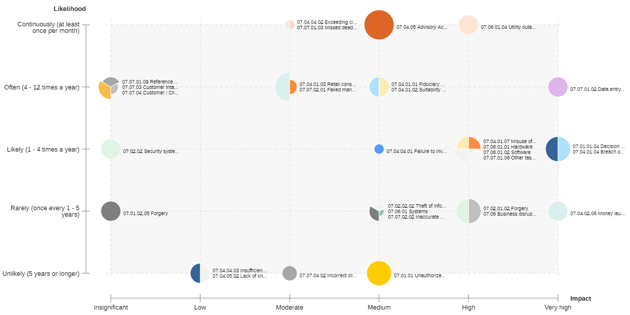
Bubble
Using a bubble chart, you can visualise objects as bubbles in a two-dimensional grid. Two attributes represent the x and y axis and an optional third attribute can be used for the bubble size.
A possible use case is the evaluation of Controls based on effectiveness, method and execution or the evaluation of Risks based on a FMEA.
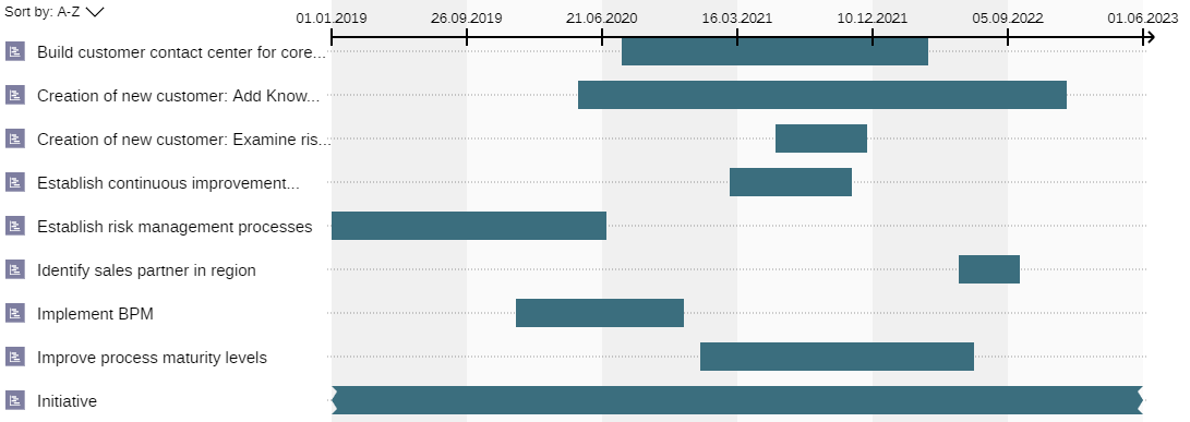
Gantt
Using a Gantt chart, you can display the chronological sequence of objects on a timeline. Two attributes determine the start and end date of a bar.
One possible use case is the visualisation of the lifecycles of Processes or planning and controlling data of Initiatives which are depicted as horizontal bars together with a timeline.
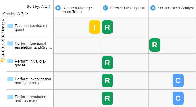
Matrix Chart
In a matrix chart, dependencies between objects can be displayed in tabular format. You can define object types for the columns and rows and visualise the connections between the objects in the cells.
A common type of matrix is the RACI matrix that helps present responsibilities in a project or organisation. It typically places the Tasks in the rows and the Roles in the columns.
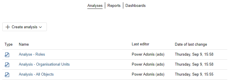
The Analyses Page
The Analyses page serves as a starting point to run analyses on a data set of your choice. All analyses that have been created are listed here, and you can create new analyses.
Open Analyses Page
To open the Analyses page:
- On the toolbar at the top of the screen, click
Analyse.
Create New Analysis
See Create Analysis.
Open an Analysis
All analyses are shown in a compact list, sorted by date of last change.
- To open an analysis, click it.
Create Analysis
Use one of the following options to create an analysis:
![]()
Use a Search Result
To create an analysis based on a search result:
On the toolbar at the top of the screen, click
Analyse.Click the
Create
analysis button, and then select From search result. The new analysis opens, with the Dataset tab selected.Perform a search. This works the same as when using the regular search function in ADONIS.
The search result will be used as the basis for the analysis. Now you can add and configure charts to visualise your data.
Manually Select Dataset
To create an analysis and manually select the dataset:
On the toolbar at the top of the screen, click
Analyse.Click the
Create
analysis button, and then select From manual selection. The new analysis opens, with the Dataset tab selected.Now do one of the following:
Drag the models and objects you want to add from the Explorer to the Dataset tab.
Click the
Add
button. Select the models or objects you want to add, and then click OK.
When you are satisfied with the initial dataset for the analysis, you can add and configure charts to visualise your data.
Directly Create Charts
You've already picked data while working with ADONIS (for example, in the Explorer) and wish to generate charts straight from this data? This is also possible. You can choose from the following options:
![]()
From the Search Function: Perform a search using the regular search function. Click the
Create chart button,
and then select a chart type.Based on a Selection of Objects and Models: Select the models or objects for the chart, e.g. in the Explorer, in an editor or in a list. Right-click the selection, point to
 Create chart, and
then select a chart type.
Create chart, and
then select a chart type.For All Objects in a Model: Open the model with the objects you want to analyse in an editor of your choice. Click the More button
 at the
top right corner of the model, point to
Create chart, and
then select a chart type.
at the
top right corner of the model, point to
Create chart, and
then select a chart type.
No matter which method you used to directly create a chart, the procedure now continues in the same way. The new analysis opens. As the data is already available, the chart tab will be selected. The centre panel showing the selected chart will yet be empty. Configure the chart in the side panel to visualise your data.
Add Charts
To add a chart to your analysis:
Click the
Chart
button, and then select a chart type. The chart opens in a new tab.In the side panel, go to the Options tab to configure the chart (either select a template or configure the chart manually):
Optionally, in the side panel, go to the Colour tab and make objects in a chart coloured to highlight some aspects of your data.
The chart will be displayed in the centre panel.
Configure Box-in-Box
A box-in-box chart shows objects of different levels as boxes nested within each other. You need to choose the object types that are used on each level of the box-in-box chart and the relations that connect the levels.
A box-in-box chart needs at least two levels.
Each level must contain at least one object type.
Neighbouring levels in a box-in-box chart are connected by relations.
The direction of the relation is shown as an arrow in the configuration.
Example: Box-in-Box Chart Configuration

To configure a box-in-box chart, use these options in the side panel on the Options tab:
Select Template
To get a quick start on creating a box-in-box chart, you can use a template:
- From the
 Select a
template for your Dataset list, select the template you want.
Select a
template for your Dataset list, select the template you want.
The necessary options will be selected automatically. You can adjust them as needed.
Templates may produce charts with a specific, non-standard representation.
Add Element
To add a new level to a box-in-box chart:
- Click the
 Add element
button.
Add element
button.
For the top level, choose an object type. For each additional level, choose an object type and the relation that connects it to the previous level.
Select Relation
To change the relation that connects an object type to the previous level:
- Click the Select relation button
 , and the choose a relation.
Remove Element
To remove a level from the box-in-box chart:
- Click the Remove element button
 .
.
If the level has child levels, they will also be removed.
Hide Level
You can hide levels to visualise relations between objects that are indirectly related to each other through another object.
To hide a level in the visualisation:
- Click the Hide level button
 .
This button is a toggle. Click it again to show the level again.
.
This button is a toggle. Click it again to show the level again.
Example: Hide Level


Customise Layout
You can specify how objects in a level which share the same parent object are positioned:
- For each level, select the number of Boxes per row before a new row is started.
Example: Set Growth Direction
Configure Bubble
A bubble chart displays objects as bubbles on an area. The area is defined by two axes (x-axis and y-axis). Specify the type of objects to be displayed and the attributes for x-axis, y-axis and bubble size. The attribute for bubble size is optional; all bubbles have the same size when the attribute is not set.
Example: Configure Bubble Chart

To configure a bubble chart, use these options in the side panel on the Options tab:
Select Template
To get a quick start on creating a bubble chart, you can use a template:
- From the Select a
template for your Dataset list, select the template you want.
The necessary options will be selected automatically. You can adjust them as needed.
Templates may produce charts with a specific, non-standard representation.
Select Object Type and Attributes
Choose which object type and attributes will appear in the bubble chart:
Object Type: Specify what type of objects should be visualised in the bubble chart.
X-Axis: Choose the attribute you want to show on the x-axis.
Y-Axis: Choose the attribute you want to show on the y-axis.
Bubble Size: Choose the attribute which determines the bubble size.
Choose Layout Options
Choose layout options to determine what the bubble chart will look like:
Reverse X-Axis: Invert the x-axis so that higher values will be shown on the left and lower values on the right.
Reverse Y-Axis: Invert the y-axis so that higher values will be shown on the bottom and lower values on the top.
Reverse Bubble Size: Invert the bubble size so that higher values mean a smaller size and lower values mean a bigger size.
Show Bubble Names: Specify whether the names of the objects should be displayed right next to the bubbles.
You can view a tooltip with the name of the object and other information when you position the mouse pointer over a bubble segment.
- Show Elements with Missing Data: Specify whether to show objects in the bubble chart where at least one of the selected attributes does not have a value defined.
Configure Gantt
A Gantt chart shows objects as bars on a timeline. Choose which object types to display in the Gantt chart and which attributes to use for the start and end dates.
Example: Configure Gantt Chart

To configure a Gantt chart, use these options in the side panel on the Options tab:
Select Template
To get a quick start on creating a Gantt chart, you can use a template:
- From the Select a
template for your Dataset list, select the template you want.
The necessary options will be selected automatically. You can adjust them as needed.
Templates may produce charts with a specific, non-standard representation.
Add Element
To add a new level to a Gantt chart:
- Click the Add element
button.
Select at least one object type. To create a hierarchical structure, select additional object types as child elements and the relations that connect them to the parent level.
Select Relation
To change the relation that connects an object type to the parent level:
- Click the Select relation button
, and the choose a relation.
Remove Element
To remove a level from the Gantt chart:
- Click the Remove element button
.
If the level has child levels, they will also be removed.
Hide Level
To hide a level in the visualisation:
- Click the Hide Level button .
This button is a toggle. Click it again to show the level again.
Example: Hide Level


Select Start and End Attributes
Choose which attributes will appear on the x-axis:
Select start: Select the attribute that represents the beginning of the bar along the timeline.
Select end: Select the attribute that represents the end of the bar along the timeline.
Configure Matrix
A matrix chart in ADONIS displays connections (Matrix cells) between objects of the x-axis and objects of the y-axis. A connection can be:
a relation between x-axis object and y-axis object or
an object which is connected with the x-axis and y-axis objects by relations
You need to specify the type of objects to be displayed on the x-axis and y-axis, and the object type or relation for the Matrix cells. If you want to choose an object type for the Matrix cells, you must define how it is connected to the objects of the x-axis and y-axis.
Example: Configure Matrix Chart

To configure a matrix chart, use these options in the side panel on the Options tab:
Select Template
To get a quick start on creating a matrix chart, you can use a template:
- From the Select a
template for your Dataset list, select the template you want.
The necessary options will be selected automatically. You can adjust them as needed.
Templates may produce charts with a specific, non-standard representation.
Select Object Types and Relations
Choose which object types and relations will appear in the matrix chart:
Columns: Choose the object types you want to show on the x-axis.
Cell: Select at least one relation that connects the objects of the x-axis and y-axis OR an object type and the relation that connects it to the objects of the x-axis. You can select multiple relations or object types.
Rows: Choose the object types you want to show on the y-axis. What needs to be selected depends on the type of connection chosen for the cells. If the connection is a relation, you can select an object type that is a valid source or target for the relation. If the connection is an object, you can select an object type AND a relation that connects it to the cell objects. You can configure multiple connections.
Choose Layout Options
Choose layout options to determine what the matrix chart will look like:
Hide "No references" column: Specify whether to hide the "No references" column. This column is only available if objects are displayed in the cells. It lists all cell objects which are not connected to x-axis objects.
Hide "No references" row: Specify whether to hide the "No references" row. This row is only available if objects are displayed in the cells. It lists all cell objects which are not connected to y-axis objects.
Hide columns without cell objects: Specify whether empty columns should be shown in the matrix chart.
Hide rows without cell objects: Specify whether empty rows should be shown in the matrix chart.
Colour cells with multiple occurrences: Specify whether cell objects that occur multiple times in the matrix chart should be highlighted using slim vertical bars.
Apply Colouring to Charts
You can make objects in a chart coloured depending on the value of an attribute to highlight some aspects of your data. For example, Risks in a matrix chart could be coloured green if their impact is low and red if their impact is high.
To apply colouring to charts, use these options in the side panel on the Colour tab:
Enable Colouring: Click the Enable colouring button
 to enable colouring. All other
options in this panel are inactive unless you click this button.
to enable colouring. All other
options in this panel are inactive unless you click this button.Select Element: Choose the object type you want to colour.
Select Attribute: Choose the attribute whose value determines how the objects in the chart will be coloured. Underneath, you will see all of the potential colours and how they are assigned to the attribute values.
Reverse Colours: To invert the colour scheme, click the Reverse colours button
.Change Colours: To change colours, click the colour circles.
Delete Chart
To delete a chart:
- The More button is activated
when you hover over the chart tab. Click this button to open a drop-down menu, and then click
Delete.
View Dataset or Charts
After creating an analysis, you can switch between viewing the dataset and the charts:
![]()
- Click the Dataset tab or the tab representing the chart you want to see.
Adjust Charts
Charts can be refreshed, renamed and zoomed in or out.
Refresh Chart
To refresh a Chart:
- Click the More button at the
top right corner of the chart, and then click Refresh
 .
.
Rename Chart
To rename a Chart:
- Click the More button at the
top right corner of the chart, and then click Rename
 .
.
Zoom in and out of a Chart
To zoom in and out of a chart:
Click the icons
 or
or
 to increase or decrease the
zoom value.
to increase or decrease the
zoom value.Click the icon
 to fit the chart
to the window size.
to fit the chart
to the window size.
Manage Dataset
Use the Dataset tab to view the current dataset and to choose the data you want to use.
![]()
Change Dataset Based on Search Result
To change a dataset that is based on a search result:
- Change the search string or the search options and filters.
Change Dataset Based on Manual Selection
To change a dataset that is based on a manual selection, choose one of the following options:
Add Models or Objects to the Dataset: Drag the models and objects you want to add from the Explorer to the Dataset tab or:
Click the Add button
. Select
the models or objects you want to add, and then click OK.Remove Models or Objects from the Dataset: Select the models and objects you want to remove, and then press <Del> or:
Click the Add button
. Select
the models or objects you want to remove, and then click the icon
.
Export Chart
To export a single chart as an Excel spreadsheet (XLSX format), PDF or image file (SVG and PNG format):
Open the chart you want to export.
Click the More button
, point
to Export  , and then
select an export format.
, and then
select an export format.
In all four formats, the graphical representation of the chart and the legend are exported. Additionally, when exporting an Excel spreadsheet, the objects included in the chart are listed on a separate sheet. When exporting a PDF, you can select the page layout and the page orientation.
In addition to exporting a single chart, you can also share the entire analysis with other users.
Due to technical limitations of the browser, when exporting a very large matrix chart as an Excel spreadsheet, the graphical representation may not be included.
Save Analysis
You can save an analysis (= specific data and selected charts) to view it again later and share it with other users. Analyses are stored in the Model Catalogue.
The following options are available:
Save
To save changes to an analysis:
Click the Save button
 in the
menu bar of the analysis.
in the
menu bar of the analysis.Enter a name for the analysis and define a target group if you are saving it for the first time.
Save as
To create a copy of the analysis with a new name:
Click the down arrow symbol
 in
the Save button .
in
the Save button .Select Save as
 from
the drop-down menu.
from
the drop-down menu.Change the name of the analysis.
Define the target group for the new analysis.
Click OK.
If an analysis only allows read access, the Save button
![]() is replaced by the Save as
button
is replaced by the Save as
button ![]() in the menu bar of the
analysis.
in the menu bar of the
analysis.
Close Analysis
To close an analysis:
- Click the icon
 at the top
right corner of the open analysis.
at the top
right corner of the open analysis.
Find Analysis
Here are some tips to find an analysis in ADONIS:
Model Catalogue: Analyses are stored in the Model Catalogue in the Explorer. You can browse the folders or use the search to find the analysis you're looking for.
Analyse
: On the
Analyses page, all analyses are shown in a compact list.
Delete Analysis
To delete an analysis:
- Right-click the analysis in the Model Catalogue, and then click Delete.