Working with Charts
Charts enable you to visualise objects and their attributes and relations in ADONIS. Large amounts of data are clearly displayed graphically and can be understood more easily.
Types of Charts
There are five types of charts in ADONIS:
Analysis: Dataset and Charts Combined
In ADONIS, you do not just create a chart, you create a comprehensive analysis. An analysis consists of a set of data and selected charts for visualisation. This means that you can easily create multiple charts from one data set. You can save an analysis for future use and even share it with your colleagues.
Create Beautiful Charts
It's easy to create attractive charts in ADONIS. Here is what you need to do:
Start by creating a new analysis.
Go to
 Analyse and
create a new analysis.
Analyse and
create a new analysis.Define the dataset. You can either use a search result or select your dataset manually.
When you are satisfied with the initial dataset for the analysis, you can add and configure charts to visualise your data.
Select the chart type you want from the
 Chart button.
Configure the chart in the side panel to visualise your data. You can customize the chart according to your wishes or simply choose one of the recommended templates for your data.
Optionally, make objects in your chart coloured to highlight some aspects of your data.
Available Charts
Let's take a look at the charts that you can create in ADONIS:
Bar
Using a bar chart, you can represent data as bars which can be aggregated across different levels.
A typical use case is the representation of the automation potential of Processes.
Box-in-Box
A box-in-box chart shows dependencies between different objects. The objects are arranged as boxes nested within each other.
A typical example is the representation of the hierarchy of a working environment with superordinate and subordinate Organisational Units.

Bubble
Using a bubble chart, you can visualise objects as bubbles in a two-dimensional grid. Two attributes represent the x and y axis and an optional third attribute can be used for the bubble size.
A possible use case is the evaluation of Controls based on effectiveness, method and execution or the evaluation of Risks based on a FMEA.
Gantt
Using a Gantt chart, you can display the chronological sequence of objects on a timeline. Two attributes determine the start and end date of a bar.
One possible use case is the visualisation of the lifecycles of Processes or planning and controlling data of Initiatives which are depicted as horizontal bars together with a timeline.
Matrix
In a matrix chart, dependencies between objects can be displayed in tabular format. You can define object types for the columns and rows and visualise the connections between the objects in the cells.
A common type of matrix is the RACI matrix that helps present responsibilities in a project or organisation. It typically places the Tasks in the rows and the Roles in the columns.
The Analyses Page
The Analyses page serves as a starting point to run analyses on a data set of your choice. All analyses that have been created are listed here, and you can create new analyses.

Open Analyses Page
To open the Analyses page:
- On the toolbar at the top of the screen, click
Analyse.
Create New Analysis
See Create Analysis.
Open an Analysis
All analyses are shown in a compact list, sorted by date of last change.
- To open an analysis, click it.
Create Analysis
Use one of the following options to create an analysis:
![]()
Use a Search Result
To create an analysis based on a search result:
On the toolbar at the top of the screen, click
Analyse.Click the
Create
analysis button, and then select From search result. The new analysis opens, with the Dataset tab selected.Perform a search. This works the same as when using the regular search function in ADONIS.
The search result will be used as the basis for the analysis. Now you can add and configure charts to visualise your data.
Manually Select Dataset
To create an analysis and manually select the dataset:
On the toolbar at the top of the screen, click
Analyse.Click the
Create
analysis button, and then select From manual selection. The new analysis opens, with the Dataset tab selected.Now do one of the following:
Drag the models and objects you want to add from the Explorer to the Dataset tab.
Click the
 Add
button. Select the models or objects you want to add, and then click OK.
Add
button. Select the models or objects you want to add, and then click OK.
When you are satisfied with the initial dataset for the analysis, you can add and configure charts to visualise your data.
Directly Create Charts
You've already picked data while working with ADONIS (for example, in the Explorer) and wish to generate charts straight from this data? This is also possible. You can choose from the following options:
![]()
From the Search Function: Perform a search using the regular search function. Click the
 Create chart button,
and then select a chart type.
Create chart button,
and then select a chart type.Based on a Selection of Objects and Models: Select the models or objects for the chart, e.g. in the Explorer, in an editor or in a list. Right-click the selection, point to
 Create chart, and
then select a chart type.
Create chart, and
then select a chart type.For All Objects in a Model: Open the model with the objects you want to analyse in an editor of your choice. Click the More button
 at the
top right corner of the model, point to
Create chart, and
then select a chart type.
at the
top right corner of the model, point to
Create chart, and
then select a chart type.
No matter which method you used to directly create a chart, the procedure now continues in the same way. The new analysis opens. As the data is already available, the chart tab will be selected. The centre panel showing the selected chart will yet be empty. Configure the chart in the side panel to visualise your data.
Add Charts
To add a chart to your analysis:
Click the
 + Chart
button, and then select a chart type. The chart opens in a new tab.
+ Chart
button, and then select a chart type. The chart opens in a new tab.In the side panel, go to the Options tab to configure the chart (either select a template or configure the chart manually):
Optionally, in the side panel, go to the Colour tab and make objects in a chart coloured to highlight some aspects of your data.
The chart will be displayed in the centre panel.
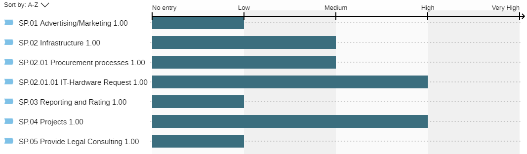
Configure Bar Chart
A bar chart represents objects as bars. Each object is given a bar. Their length is defined by an attribute.
Bar charts must have at least one level. If they have multiple levels, only the objects of the lowest level are represented by bars. However, the values of the lowest level can be aggregated across different levels.
Example: Configure Bar Chart
The configuration of a simple bar chart could look like this:

Process, and the length of the bars is based on the Automation potential attribute.
This bar chart visualises the automation potential of Processes.
To configure a bar chart, use these options in the side panel on the Options tab:
Select Template
To get a quick start on creating a bar chart, you can use a template:
- From the
 Check out the
available templates for your dataset list, select the template you want.
Check out the
available templates for your dataset list, select the template you want.
The necessary options will be selected automatically. You can adjust them as needed.
Templates may produce charts with a specific, non-standard representation.
Add Elements
To add the first level to a bar chart:
- Click the
 Select an
element from the dataset button, and then choose an object type from the dataset.
Select an
element from the dataset button, and then choose an object type from the dataset.
At least this first level needs to be created.
If the dataset only contains one type of object, it will be pre-selected and you can omit this step.
Optionally, to create a hierarchical structure, you can add additional levels to a bar chart:
- Select a level in the configuration, click the
Add button, and then
choose an object type.
The relation that connects the object type to the previous level will be automatically selected by ADONIS.
You can always add new levels below a level. Only when the top level is selected can you add a level above it.
Adjust Elements
Elements can be removed, relations between levels can be changed, and levels can be hidden.
Remove Element: Select a level in the configuration, and then click the Remove element button
 . The level will be removed from
the bar chart. If the level has child levels, they will also be removed.
. The level will be removed from
the bar chart. If the level has child levels, they will also be removed.Change Relation: Select a level in the configuration, click the Select relation button
 , and then choose a relation.
The relation that connects the object type to the previous level will be changed.
, and then choose a relation.
The relation that connects the object type to the previous level will be changed.Hide Level: Select a level in the configuration, and then click the Hide level button
 . This button is a toggle.
Click it again to show the level again.
. This button is a toggle.
Click it again to show the level again.
Select Attribute for Bars
Choose the attribute that determines the bar length:
- From the Bar dimension list, select the attribute you want.
You can select the following types of attributes:
Enumeration: Attributes that are an enumeration (= a predefined set of values you can choose from).
Number: Attributes that store integers or floating point numbers.
If the bar chart has multiple levels, you can only choose an attribute for the lowest level.
If the lowest level of the bar chart contains multiple object types, only attributes that are shared by all of them can be selected.
Choose Layout Options
Choose layout options to determine what the bar chart will look like:
Reverse X-Axis: Invert the x-axis so that higher values will be shown on the left and lower values on the right.
Show Elements with Missing Data: Specify whether to show objects in the bar chart where at least one of the selected attributes does not have a value defined.
The layout option Reverse X-Axis is only available if the bar attribute is an enumeration.
The layout option Show Elements with Missing Data is only available if the bar chart has only one level AND the bar attribute is an enumeration.
Choose Aggregation Method
If a bar chart has multiple levels, bars are normally only shown for the values of the lowest level. However, these values can be aggregated across different levels. The combined values are then displayed as additional bars in the higher levels.
To choose an aggregation method for a bar chart:
From the Aggregation method list, select the method for calculating the aggregated value:
Maximum: Shows the largest value.
Minimum: Shows the smallest value.
Average: Shows the arithmetic mean (= sum of all values divided by number).
Sum: All values are added up.
This option is only available if the bar attribute is a number.
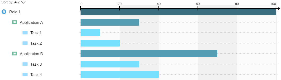
Example: Aggregate Data
The configuration of a bar chart could look like this:
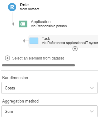
Role
<Responsible person<Application<Referenced applications/IT system elements<TaskIn the visualisation, the values of the first level are aggregated to the second level, and the values of the second level are then aggregated to the third level.
The chosen aggregation method is Sum, meaning that all values are added up.
Configure Box-in-Box Chart
A box-in-box chart shows objects of different levels as boxes nested within each other. You need to choose the object types that are used on each level of the box-in-box chart and the relations that connect the levels.
A box-in-box chart needs at least two levels.
Each level must contain at least one object type.
Neighbouring levels in a box-in-box chart are connected by relations.
The direction of the relation is shown as an arrow in the configuration.
Example: Box-in-Box Chart Configuration
The configuration of a simple box-in-box chart could look like this:

Organisational Unit
>Responsible Person>RoleThis box-in-box chart has two levels. The first level contains the object type Organisational Unit. The second level contains the object type Role. The relation Responsible Person connects the first level and the second level of the box-in-box chart. The direction is from the first level to the second.
To configure a box-in-box chart, use these options in the side panel on the Options tab:
Select Template
To get a quick start on creating a box-in-box chart, you can use a template:
- From the Check out the
available templates for your dataset list, select the template you want.
The necessary options will be selected automatically. You can adjust them as needed.
Templates may produce charts with a specific, non-standard representation.
Add Elements
To add the first level to a box-in-box chart:
- Click the Select an
element from the dataset button, and then choose an object type from the dataset.
If the dataset only contains one type of object, it will be pre-selected and you can omit this step.
To add additional levels to a box-in-box chart:
- Select a level in the configuration, click the
Add button, and then
choose an object type.
The relation that connects the object type to the previous level will be automatically selected by ADONIS.
You can always add new levels below a level. Only when the top level is selected can you add a level above it.
Select Relation
To change the relation that connects an object type to the previous level:
- Select a level in the configuration, click the Select relation button
, and then choose a relation.
Remove Element
To remove a level from the box-in-box chart:
- Select a level in the configuration, and then click the Remove element button
.
If the level has child levels, they will also be removed.
Hide Level
You can hide levels to visualise relations between objects that are indirectly related to each other through another object.
To hide a level in the visualisation:
- Select a level in the configuration, and then click the Hide level button
. This button is a toggle.
Click it again to show the level again.
Example: Hide Level
In the following configuration, the second level of the box-in-box chart is hidden:

Document
>Document Owner>Role<Assigned users (role holders)<UserIn the visualisation, the objects of the first level directly contain the children of the hidden level (= the objects of the third level).
The Documents contain the Users.
The Roles are not visualised at all.

Customise Layout
You can specify how objects in a level which share the same parent object are positioned:
- For each level, select the number of Boxes per row before a new row is started.
Example: Set Growth Direction
Growth direction for the second level of the box-in-box chart is set as follows:
![]()
Horizontal, with 4 items per row
In the visualisation, four objects are placed in the first row, and then a new row is started.
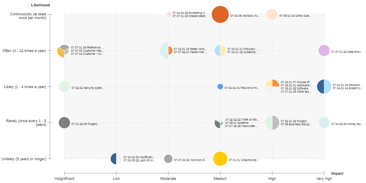
Configure Bubble Chart
A bubble chart displays objects as bubbles on an area. The area is defined by two axes (x-axis and y-axis). Specify the type of objects to be displayed and the attributes for x-axis, y-axis and bubble size. The attribute for bubble size is optional; all bubbles have the same size when the attribute is not set.
Example: Configure Bubble Chart
The configuration of a simple bubble chart could look like this:

Risk, with the attributes Impact for the x-axis and Likelihood for the y-axis.
This bubble chart can be used to evaluate Risks.
To configure a bubble chart, use these options in the side panel on the Options tab:
Select Template
To get a quick start on creating a bubble chart, you can use a template:
- From the Check out the
available templates for your dataset list, select the template you want.
The necessary options will be selected automatically. You can adjust them as needed.
Templates may produce charts with a specific, non-standard representation.
Select Object Type and Attributes
Choose which object type and attributes will appear in the bubble chart:
Object Type: Specify what type of objects should be visualised in the bubble chart.
X-Axis: Choose the attribute you want to show on the x-axis.
Y-Axis: Choose the attribute you want to show on the y-axis.
Bubble Size: Choose the attribute which determines the bubble size.
Choose Layout Options
Choose layout options to determine what the bubble chart will look like:
Reverse X-Axis: Invert the x-axis so that higher values will be shown on the left and lower values on the right.
Reverse Y-Axis: Invert the y-axis so that higher values will be shown on the bottom and lower values on the top.
Reverse Bubble Size: Invert the bubble size so that higher values mean a smaller size and lower values mean a bigger size.
Show Bubble Names: Specify whether the names of the objects should be displayed right next to the bubbles.
You can view a tooltip with the name of the object and other information when you position the mouse pointer over a bubble segment.
- Show Elements with Missing Data: Specify whether to show objects in the bubble chart where at least one of the selected attributes does not have a value defined.
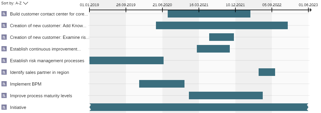
Configure Gantt Chart
A Gantt chart shows objects as bars on a timeline. Choose which object types to display in the Gantt chart and which attributes to use for the start and end dates.
Example: Configure Gantt Chart
The configuration of a simple Gantt chart could look like this:

Initiative, with the attributes Planned start and Planned end to visualise a time period.
This Gantt chart visualises the lifetime of Initiatives from the beginning to the end.
To configure a Gantt chart, use these options in the side panel on the Options tab:
Select Template
To get a quick start on creating a Gantt chart, you can use a template:
- From the Check out the
available templates for your dataset list, select the template you want.
The necessary options will be selected automatically. You can adjust them as needed.
Templates may produce charts with a specific, non-standard representation.
Add Elements
To add the first level to a Gantt chart:
- Click the Select an
element from the dataset button, and then choose an object type from the dataset.
At least this first level needs to be created.
If the dataset only contains one type of object, it will be pre-selected and you can omit this step.
Optionally, to create a hierarchical structure, you can add additional levels to a Gantt chart:
- Select a level in the configuration, click the
Add button, and then
choose an object type.
The relation that connects the object type to the previous level will be automatically selected by ADONIS.
You can always add new levels below a level. Only when the top level is selected can you add a level above it.
Select Relation
To change the relation that connects an object type to the previous level:
- Select a level in the configuration, click the Select relation button
, and then choose a relation.
Remove Element
To remove a level from the Gantt chart:
- Select a level in the configuration, and then click the Remove element button
.
If the level has child levels, they will also be removed.
Hide Level
To hide a level in the visualisation:
- Select a level in the configuration, and then click the Hide level button
. This button is a toggle.
Click it again to show the level again.
Example: Hide Level
In the following configuration the second level of the Gantt chart is hidden:

Application
>Realization>Application Service>Association>Application InterfaceIn the visualisation, the Application Services are not visualised:

Select Start and End Attributes
Choose which attributes will appear on the x-axis:
Select start: Select the attribute that represents the beginning of the bar along the timeline.
Select end: Select the attribute that represents the end of the bar along the timeline.
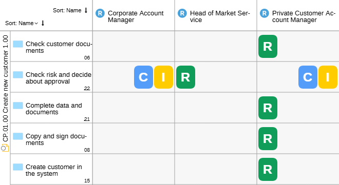
Configure Matrix Chart
A matrix chart in ADONIS displays connections (matrix cells) between objects of the x-axis and objects of the y-axis. A connection can be:
a relation between x-axis object and y-axis object or
an object which is connected with the x-axis and y-axis objects by relations
You need to specify the type of objects to be displayed on the x-axis and y-axis, and the object type or relation for the matrix cells. If you want to choose an object type for the matrix cells, you must define how it is connected to the objects of the x-axis and y-axis.
Example: Configure Matrix Chart
The configuration of a simple matrix chart could look like this:

Task
>Responsible for execution>RoleThis simple RACI matrix shows Roles in the columns and Tasks in the rows.
To configure a matrix chart, use these options in the side panel on the Options tab:
Select Template
To get a quick start on creating a matrix chart, you can use a template:
- From the Check out the
available templates for your dataset list, select the template you want.
The necessary options will be selected automatically. You can adjust them as needed.
Templates may produce charts with a specific, non-standard representation.
Select Object Types and Relations
Choose which object types and relations will appear in the matrix chart:
Rows: Choose the object types you want to show on the y-axis.
Cell: Select at least one relation that connects the objects of the x-axis and y-axis OR an object type and the relation that connects it to the objects of the y-axis. You can select multiple relations or object types.
Columns: Choose the object types you want to show on the x-axis. What needs to be selected depends on the type of connection chosen for the cells. If the connection is a relation, you can select an object type that is a valid source or target for the relation. If the connection is an object, you can select an object type AND a relation that connects it to the cell objects. You can configure multiple connections.
Choose Layout Options
Choose layout options to determine what the matrix chart will look like:
Hide "No references" column: Specify whether to hide the "No references" column. This column is only available if objects are displayed in the cells. It lists all cell objects which are not connected to x-axis objects.
Hide "No references" row: Specify whether to hide the "No references" row. This row is only available if objects are displayed in the cells. It lists all cell objects which are not connected to y-axis objects.
Hide columns without cell objects: Specify whether empty columns should be shown in the matrix chart.
Hide rows without cell objects: Specify whether empty rows should be shown in the matrix chart.
Colour cells with multiple occurrences: Specify whether cell objects that occur multiple times in the matrix chart should be highlighted using slim vertical bars.
The layout options Hide "No references" column, Hide "No references" row and Colour cells with multiple occurrences are only relevant if objects are displayed in the matrix cells. They will be hidden if you select a relation for the matrix cells.
Apply Colouring to Charts
You can make objects in a chart coloured depending on the value of an attribute to highlight some aspects of your data. For example, Risks in a matrix chart could be coloured green if their impact is low and red if their impact is high.
To apply colouring to charts, use these options in the side panel on the Colour tab:
Enable Colouring: Click the Enable colouring button
 to enable colouring. All other
options in this panel are inactive unless you click this button.
to enable colouring. All other
options in this panel are inactive unless you click this button.Select Element: Choose the object type you want to colour.
Select Attribute: Choose the attribute whose value determines how the objects will be coloured. If the attribute is an enumeration, you will immediately see the colour assignment to the values of the attribute. If the attribute represents a number or a date, you have to set values for colouring first (see below).
Reverse Colours: To invert the colour scheme, click the Reverse colours button
.Change Colours: To change colours, click the colour circles.
+ Add Colouring: Click the + Add Colouring button
to create an additional
colouring rule for a different object type. When clicked, a new set of controls appears below
the current set. You can add as many colouring rules as there are different object types. This
allows you to colour multiple object types either according to the same attribute (if they
share that attribute), or according to different attributes.
Set Values for Colouring
The initial colour assignment to the values of the attribute will differ depending on the data type of the selected attribute.
Enumeration: If the selected attribute is an enumeration (= a predefined set of values you can choose from), then you don't need to do anything. Each value is automatically assigned a colour by ADONIS.
Number: For attributes that store integers or floating point numbers, you can define up to 5 different value ranges and assign them to a colour. Define the value range in the From and To fields. A colour will be preselected for each value range. You can add or remove value ranges by clicking the "+" and "x" icons.
Date: For attributes that store a date, you can define up to 5 different time periods and assign them to a colour. Define the period in the From and Until fields. You can either enter the start date and the end date manually or select them in the calendar. A colour will be preselected for each time period. You can add or remove time periods by clicking the "+" and "x" icons.
Delete Chart
To delete a chart:
- The More button is activated
when you hover over the chart tab. Click this button to open a drop-down menu, and then click
Delete.
View Dataset or Charts
After creating an analysis, you can switch between viewing the dataset and the charts:
![]()
- Click the Dataset tab or the tab representing the chart you want to see.
Adjust Charts
Charts can be refreshed, renamed, zoomed in or out, and more.
Refresh Chart
To refresh a chart:
- Click the More button at the
top right corner of the chart, and then click Refresh
 .
.
Rename Chart
To rename a chart:
- Click the More button at the
top right corner of the chart, and then click Rename
 .
.
Zoom in and out of a Chart
To zoom in and out of a chart:
Click the icons
 or
or
 to increase or decrease the
zoom value.
to increase or decrease the
zoom value.Click the icon
 to fit the chart
to the window size.
to fit the chart
to the window size.
Sort Objects
You can sort a bar chart, a Gantt chart or a matrix chart to show objects in the order you want.
To sort objects alphabetically (A to Z or Z to A):
- Click the up
 or down arrow
 next to Sort: Name at the top
left corner of the chart.
next to Sort: Name at the top
left corner of the chart.
Both rows and columns can be sorted in a matrix chart.
A special sorting option is available for matrix charts that show flow objects. To sort objects according to their order in a model:
Click the button
 next to Sort:
Name. A drop-down menu opens. Select Order.
next to Sort:
Name. A drop-down menu opens. Select Order.Click the up
or down arrow
next to Sort: Order.
Manage Dataset
Use the Dataset tab to view the current dataset and to choose the data you want to use.
![]()
Change Dataset Based on Search Result
To change a dataset that is based on a search result:
- Change the search string or the search options and filters.
Change Dataset Based on Manual Selection
To change a dataset that is based on a manual selection, choose one of the following options:
Add Models or Objects to the Dataset: Drag the models and objects you want to add from the Explorer to the Dataset tab or:
Click the
Add button.
Select the models or objects you want to add, and then click OK.Remove Models or Objects from the Dataset: Select the models and objects you want to remove, and then press <Del> or:
Click the
Add button.
Deselect the models or objects you want to remove, and then click OK.
Export Chart
To export a single chart as an Excel spreadsheet (XLSX format), PDF or image file (SVG and PNG format):
Open the chart you want to export.
Click the More button
, point
to Export  , and then
do one of the following:
, and then
do one of the following:Click Export image to export an image file. You can select the desired graphic options such as the image format (PNG or SVG) and the scale.
Click Print PDF to export a PDF. You can select the desired print settings such as the paper size and the orientation (portrait or landscape).
Click Export to Excel to export an Excel spreadsheet.
In all formats, the graphical representation of the chart and the legend are exported. Additionally, when exporting an Excel spreadsheet, the objects included in the chart are listed on a separate sheet.
Crop Image
Before you export a chart as an image file, you can crop the image:
- Press and hold <Ctrl>, <Shift> and the left mouse button and drag a frame around the part of the chart which shall appear in the graphic file.
In addition to exporting a single chart, you can also share the entire analysis with other users.
Due to technical limitations of the browser, when exporting a very large matrix chart as an Excel spreadsheet, the graphical representation may not be included.
Manage Templates
Designated power users can save chart configurations as templates for future use and to make them available for others. They can also perform administrative tasks, such as renaming or deleting both user-created and predefined templates.
To manage templates and utilise the functions described below, a user must have access rights to the ADONIS Administration.
Create New Template
To create a new template from a chart configuration:
In the side panel on the Options tab, click Save template, and then click Save as new template.
Enter a name and description for the template in every language ADONIS supports. At least the name in the primary language is required.
Click Save.
A success message appears. Close the message to complete the process.
Save Modified Template
To save a modified template after changing the chart configuration:
In the side panel on the Options tab, click Save template, and then click Update template.
When prompted to continue, click Save.
A success message appears. Close the message to complete the process.
Rename Template
To change the name and description of a template:
In the side panel on the Options tab, below the template name, click Rename.
Modify the name and description as needed.
Click Save.
A success message appears. Close the message to complete the process.
Delete Template
To delete a template:
In the side panel on the Options tab, below the template name, click Delete.
When prompted to continue, click Save.
A success message appears. Close the message to complete the process.
Charts with a Special Appearance
Templates may produce charts with a specific, non-standard representation.
The availability of these templates depends on the Application Library and product configuration.
In the ADONIS BPMS Application Library, the following charts with a special appearance are available:
RACI (Matrix) - for Initiatives and Tasks
OMRA (Matrix) - for Processes
Value at Risk (Matrix) - for Processes and Tasks
Completion and Progress (Matrix) - for Initiatives
Maturity Assessment (Matrix) - for Control Objectives
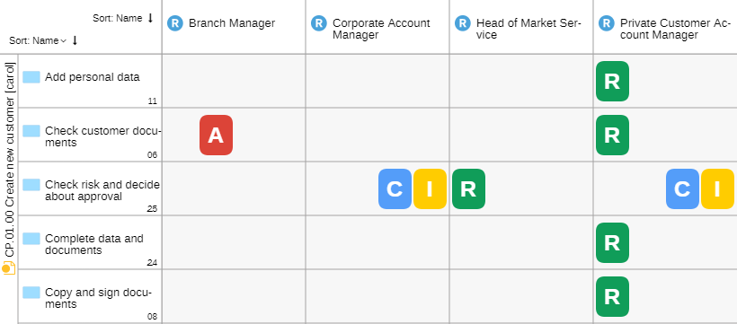
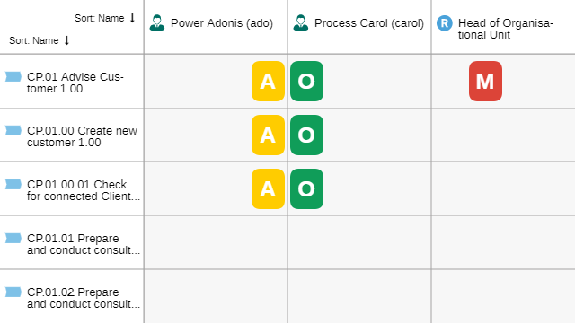
RACI [Initiatives and Tasks]
A changed visualisation is available for matrix charts based on the following templates:
Initiative Responsibilities (RACI)
Process Activities Responsibilities (RACI)
These visualisations show which persons participate in implementing Initiatives or completing Tasks. The following icons are used:
 Responsible: Persons who do the
work to implement the Initiative or achieve the Task.
Responsible: Persons who do the
work to implement the Initiative or achieve the Task. Accountable: Persons who are
ultimately accountable for approving the results.
Accountable: Persons who are
ultimately accountable for approving the results. Consulted: Persons whose
opinions are sought.
Consulted: Persons whose
opinions are sought. Informed: Persons who are kept
up-to-date on progress.
Informed: Persons who are kept
up-to-date on progress.
OMRA [Processes]
A changed visualisation is available for matrix charts based on the following template:
- Process Responsibilities (OMRA)
This visualisation shows Process objects and their owners and responsible persons in ADONIS. The following icons are used:
 Process owner: Person who is
overall responsible for the Process.
Process owner: Person who is
overall responsible for the Process. Process manager: Person who
supports the Process owner in the day-to-day management of the Process.
Process manager: Person who
supports the Process owner in the day-to-day management of the Process. Methodical reviewer: Person who
is in charge of ensuring consistent models across the organisation.
Methodical reviewer: Person who
is in charge of ensuring consistent models across the organisation. Process analyst/designer:
Person who is in charge of keeping the process up-to-date within ADONIS.
Process analyst/designer:
Person who is in charge of keeping the process up-to-date within ADONIS.
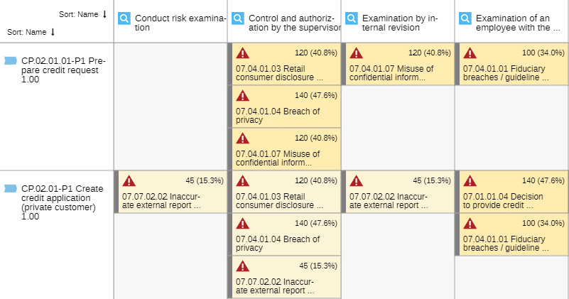
Value at Risk [Processes and Tasks]
A changed visualisation is available for matrix charts based on the following templates:
Control-Risk-Process
Control-Risk-Task
These visualisations show the Risks assigned to Processes or Tasks as well as the Controls that mitigate them.
The Risks are displayed in the cells. The calculated Value at risk is shown for each Risk both as an absolute value and a percentage. Additionally, each 25 percent range is represented by a different cell colour:
 0% - 25%
 26% - 50%
 51% - 75%
 76% - 100%
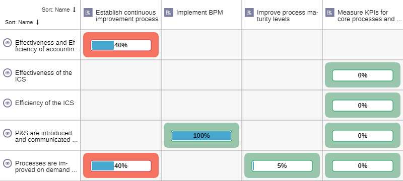
Completion and Progress [Initiatives]
A changed visualisation is available for matrix charts based on the following template:
- Initiatives
This visualisation shows repository objects and their assigned Initiatives. In the matrix cells, two attributes are displayed for each Initiative. This allows you to see at a glance:
 Degree of completion: The
degree of completion of the Initiative in the form of a percentage and status bar.
Degree of completion: The
degree of completion of the Initiative in the form of a percentage and status bar. Good |
 Bad | Progress (automatic):
The progress of the Initiative. Automatically calculated based on a comparison of the "as is"
state against the "to be" state of the time, costs and efforts spent on the Initiative.
Bad | Progress (automatic):
The progress of the Initiative. Automatically calculated based on a comparison of the "as is"
state against the "to be" state of the time, costs and efforts spent on the Initiative.
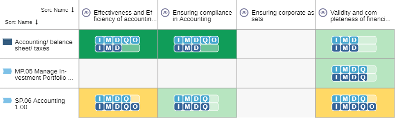
Maturity Assessment [Control Objectives]
A changed visualisation is available for matrix charts based on the following template:
- Control Objective (Compliance)
This visualisation helps assess the maturity level of Control Objectives assigned to repository objects.
The matrix cells display two attributes from the properties of the Assigned control objectives reference, which links the repository objects and the Control Objectives:
 As-is maturity level: The
extent to which the Control Objective is currently being achieved.
As-is maturity level: The
extent to which the Control Objective is currently being achieved. To-be maturity level: The
extent to which the Control Objective is planned to be achieved.
To-be maturity level: The
extent to which the Control Objective is planned to be achieved.
The letters have the following meaning:
(I)nitial (M)anaged (D)efined (Q)uantitatively managed (O)ptimising
Based on a comparison of the "as is" state against the "to be" state of the maturity level, different cell colours indicate whether the planned maturity level is being met:
 Overmatch (As-is > To-be)
 Match (As-is = To-be)
 Undermatch (As-is < To-be)
Save Analysis
You can save an analysis (= specific data and selected charts) to view it again later and share it with other users. Analyses are stored in the Model Catalogue.
The following options are available:
Save
To save changes to an analysis:
Click the Save button
 in the
menu bar of the analysis.
in the
menu bar of the analysis.Enter a name for the analysis and define a target group if you are saving it for the first time.
Save as
To create a copy of the analysis with a new name:
Click the down arrow symbol
in
the Save button .Select Save as
 from
the drop-down menu.
from
the drop-down menu.Change the name of the analysis.
Define the target group for the new analysis.
Click OK.
If an analysis only allows read access, the Save button
![]() is replaced by the Save as
button
is replaced by the Save as
button ![]() in the menu bar of the
analysis.
in the menu bar of the
analysis.
Close Analysis
To close an analysis:
- Click the icon
 at the top
right corner of the open analysis.
at the top
right corner of the open analysis.
Find Analysis
Here are some tips to find an analysis in ADONIS:
Model Catalogue: Analyses are stored in the Model Catalogue in the Explorer. You can browse the folders or use the search to find the analysis you're looking for.
Analyse
: On the
Analyses page, all analyses are shown in a compact list.
Delete Analysis
To delete an analysis:
- Right-click the analysis in the Model Catalogue, and then click Delete.