Configurable Dashboards
With configurable dashboards, you can set up your own personalised digital workspace that brings together key information and metrics relevant to your role. A configurable dashboard serves as a central hub, combining data from different business processes and systems and presenting it in an intuitive, actionable format.
You can view dashboards your colleagues have set up, finding them quickly using the integrated search. Or create your own from scratch, choosing widgets from the widget library and arranging them freely to highlight what matters most, tailoring your workspace to your specific needs and priorities.
The Dashboards Page
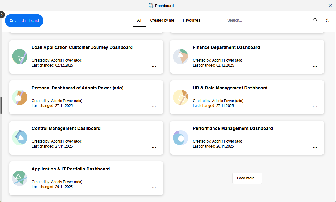
The Dashboards page is your starting point for accessing and managing dashboards. Here, all dashboards that have been created are listed, and you can also create new dashboards from scratch.
Open Dashboards Page
To open the Dashboards page:
- At the top left of the screen, select
 Dashboards.
Create New Dashboard
See Create and Configure Dashboard.
Open a Dashboard
All dashboards are shown as tiles and sorted by date of last change.
- To open a dashboard, click it.
Create and Configure Dashboard
It's easy to create your own dashboards. Here is what you need to do:
Open the Dashboards page.
Set up the new dashboard:
- Click Create Dashboard, enter a meaningful name, and then click Create. The new dashboard opens.
Add and configure widgets to visualise data:
Click + Add widget to open the widget library on the right. It contains two tabs: Standard and Pre-built.
Drag widgets to the dashboard and click
 Configure to edit the
settings:
Configure to edit the
settings:
Reposition and resize widgets as needed:
Use the drag handle
 on the
top left to move a widget to a new position.
on the
top left to move a widget to a new position.Use the handle
 on the
bottom right to adjust the widget size.
on the
bottom right to adjust the widget size.
Save your dashboard when finished:
- Click Save
For all widgets, text fields such as Title or Description can optionally be translated into all
languages ADONIS supports. Click  Translate next to the field and enter the translations.
Configure Bar Chart
The Bar Chart widget represents data as bars, allowing you to compare values across categories at a glance. The length of each bar is determined by the underlying dataset and the selected aggregation method.
After adding the widget, configure it using the following options (mandatory fields are marked with *):
Title*: Enter a title for the widget.
Description: Provide a short explanation of what the chart displays.
Query*: Select a query to define the dataset for the widget. You can choose between:
Saved queries: Queries created using the search function in ADONIS. These include private queries you created and public queries.
Built-in queries: Predefined queries provided by ADONIS that represent commonly used views on models and objects.
The selected query determines which elements are included in the dataset.
Group by*: Select the property that defines the bars in the chart. You can only choose enumeration attributes or relations that are displayed as columns in the search result.
Bar size: Defines how the length of each bar is calculated. You have two main options:
Query row count (default): Each bar shows the number of entries in that group.
Aggregation: Select a numeric attribute from the search result for the Value. Bars still represent the groups (e.g., responsible persons), but their lengths now correspond to the aggregated attribute value. Choose the aggregation method Sum, Average, Min, or Max.
Set colours: Choose colours for the bars. You can select them from the colour circles or enter hex values (e.g.
#d62fd6).Show legend: Toggle to show or hide the chart legend.
Chart layout: Choose whether to display the bars vertically or horizontally.
Position of labels: If a horizontal layout is selected, choose whether labels appear inside or outside the bars.
Sort by: Define how bars are sorted. Possible values are Default, Name (ascending), Name (descending), Value (ascending), and Value (descending).
Example: Visualise Risk Distribution
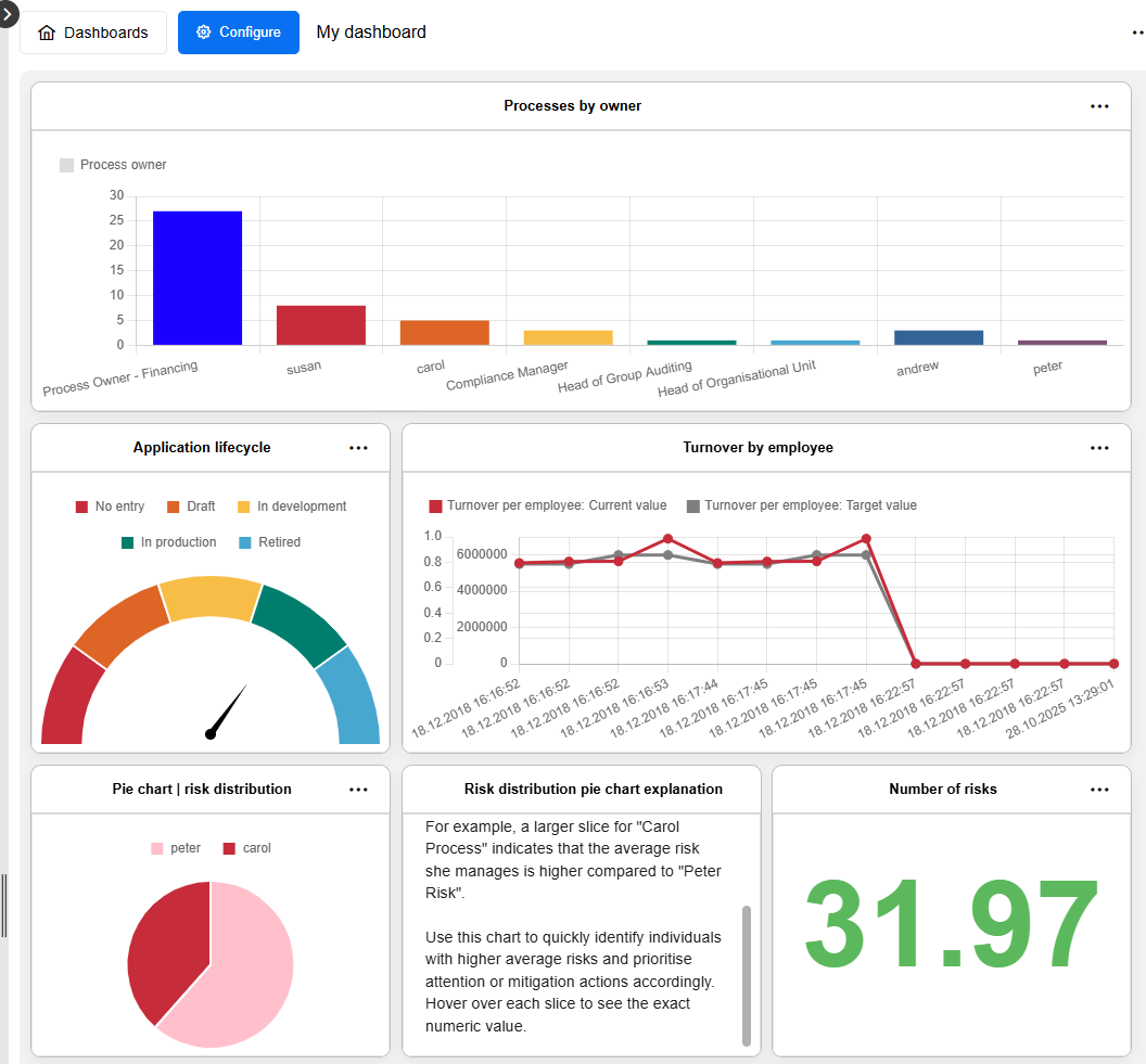
For example, you can create a bar chart based on a saved query for Risks that includes the Responsible Person relation and the Value at Risk attribute as columns. When you select Responsible Person under Group by and Query row count under Bar size, the bars represent each responsible person, and their lengths show how many risks each person is responsible for (e.g., "Peter Risk" 8, "Carol Process" 5).

If you instead choose Value at Risk for the Bar size and set the aggregation method to Average, the bars still represent the responsible persons, but now their lengths correspond to the average risk value per person (e.g., "Peter Risk" 40, "Carol Process" 120).

Once you have configured all options, click Save to apply your settings and add the bar chart to the dashboard.
Configure Gauge Chart
The Gauge Chart widget represents data as a single value displayed on a dial, helping you to quickly assess a key metric or status at a glance. It can be used either to display the value of a single artefact or to aggregate values across multiple artefacts of the same type.
After adding the widget, configure it using the following options (mandatory fields are marked with *):
Title*: Enter a title for the widget.
Description: Provide a short explanation of what the gauge chart displays.
Data source selection*: Select how the value of the gauge chart is determined. You can choose between:
Query (default): The gauge chart is based on a saved or built-in query and aggregates values across all artefacts returned by the query.
Artefact: The gauge chart is based on a single artefact selected manually.
Depending on the selected data source, different configuration options are available:
Options for Query:
Query*: Select a saved or built-in query.
Value*: Select the attribute whose values are used for the gauge calculation. You can select an enumeration attribute or a numeric attribute.
Aggregation*: Define how the values of the artefacts returned by the query are aggregated. Possible values are Average and Median.
Set colours: Define the colour of the gauge, for example by entering a hex value such as
#109D59.
Options for Artefact:
Artefact*: Select a single model or object. Selecting multiple artefacts is not supported.
Attribute*: Select an enumeration attribute or a numeric attribute whose value should be displayed on the gauge.
Set colours: Define the colour of the gauge.
Example: Visualise Application Type (Artefact Selection)
For example, if you select the application "Accounts and Payments System (GIR)" as the artefact and the attribute Application type, the gauge will display the corresponding value, such as No entry, Other, or Database.

Once you have configured all options, click Save to apply your settings and add the gauge chart to the dashboard.
Configure Line Chart
The Line Chart widget represents data as lines, allowing you to visualise changes or trends over time. Each line connects data points derived from a record attribute of a selected artefact.
After adding the widget, configure it using the following options (mandatory fields are marked with *):
Title*: Enter a title for the widget.
Description: Provide a short explanation of what the chart displays.
Artefact*: Click + Artefact and select one or more models or objects whose data you want to display in the line chart.
- Set colours: This option becomes available once one or more columns from the record
attribute have been selected under Y axis. Choose colours for the lines. You can select
them from the colour circles or enter hex values (e.g.
#d62fd6).
- Set colours: This option becomes available once one or more columns from the record
attribute have been selected under Y axis. Choose colours for the lines. You can select
them from the colour circles or enter hex values (e.g.
Attribute*: Select a record attribute of the chosen artefact. The attribute must contain structured records, such as historical values or logged measurements. Each record entry represents one data point on the chart.
X axis*: Select the column from the record attribute to be used for the X axis. This typically represents time (for example, Date).
Y axis*: Select one or more columns from the record attribute to be displayed as lines. Each selected column creates one line in the chart (for example, Current value and Target value).
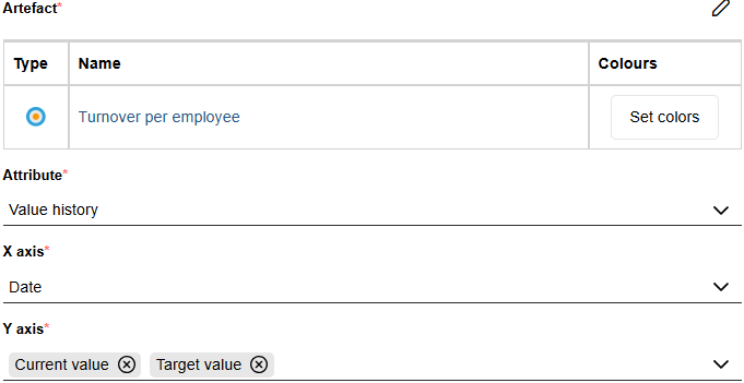
Example: Visualise Performance Indicator Trends
For example, the Performance Indicator object type includes the record attribute Value history, which logs changes in indicator values over time. The attribute contains the columns Current value, Target value, State, and Date. Each time the current value changes, a new entry is created with the associated target value, state, and date.
If you select the Performance Indicator "Turnover per employee" as the artefact, choose Value history as the attribute, Date for the X axis, and both Current value and Target value for the Y axis, the resulting line chart will display two lines over time – one for the current and one for the target value of the performance indicator.
Once you have configured all options, click Save to apply your settings and add the line chart to the dashboard.
Configure Pie Chart
The Pie Chart widget represents data as proportional slices of a circle, allowing you to compare values as parts of a whole. Each slice represents either a category or a numerical interval, and its size reflects the number of entries or an aggregated value.
After adding the widget, configure it using the following options (mandatory fields are marked with *):
Title*: Enter a title for the widget.
Description: Provide a short explanation of what the chart displays.
Query*: Select a query to define the dataset for the widget. You can choose between:
Saved queries: Queries created using the search function in ADONIS. These include private queries you created and public queries.
Built-in queries: Predefined queries provided by ADONIS that represent commonly used views on models and objects.
The selected query determines which elements are included in the dataset.
Group by*: Select the property that defines the slices of the pie. You can choose between:
Enumeration attributes or relations that are displayed as columns in the search result.
Numeric attributes that are displayed as columns in the search result. When a numeric attribute is selected, the pie chart groups values into numerical intervals instead of categories.
Depending on which property you select under Group by, different configuration options are available:
Options for enumeration attributes or relations:
Value: Defines how the size of each slice is calculated. You have two main options:
Query row count (default): Each slice represents the number of entries in that group.
Aggregation: Select a numeric attribute from the search result for the Value. The size of each slice corresponds to the aggregated attribute value. Choose the aggregation method Sum, Average, Min, or Max.
Set colours: Choose colours for the slices. You can select them from the colour circles or enter hex values (e.g.
#5cb85c).Sort by: Define how slices are ordered. Possible values are Default, Name (ascending), Name (descending), Value (ascending), and Value (descending).
Options for numeric attributes:
Label numerical intervals: This section allows you to define how numeric values are grouped into intervals and displayed as pie slices:
By default, two intervals are defined. You can add additional intervals by clicking + Add interval.
Each interval consists of a Colour, a Label, and a numeric boundary:
The first (upper) interval defines an upper boundary using Up to, defining the slice that contains elements with values up to the specified limit.
The last (lower) interval defines a lower boundary using From, defining the slice that contains elements with values greater than or equal to the specified limit.
Any additional intervals added between the first and last use Up to to define their upper boundary.
Example: Visualise Risk Distribution (Relation)
For example, you can create a pie chart based on a saved query for Risks that includes the Responsible Person relation and the Value at Risk attribute as columns. When you select Responsible Person under Group by and Query row count under Value, each slice of the pie represents a responsible person, and its size shows how many risks each person is responsible for (e.g., "Peter Risk" 80, "Carol Process" 5).
If you instead choose Value at Risk for the Value and set the aggregation method to Average, the slices still represent the responsible persons, but their sizes correspond to the average risk value per person (e.g., "Peter Risk" 40, "Carol Process" 120).
Once you have configured all options, click Save to apply your settings and add the pie chart to the dashboard.
Configure Table
The Table widget displays data in a structured, tabular format. Each row represents a model or object returned by a query, and each column corresponds to a property included in that search result.
This widget is ideal for showing detailed information at a glance, such as lists of risks, processes, or applications with key attributes like owner, status, or value.
After adding the widget, configure it using the following options (mandatory fields are marked with *):
Title*: Enter a title for the widget.
Description: Provide a short explanation of what the table displays.
Query*: Select a query to define the dataset for the widget. You can choose between:
Saved queries: Queries created using the search function in ADONIS. These include private queries you created and public queries.
Built-in queries: Predefined queries provided by ADONIS that represent commonly used views on models and objects.
The selected query determines which elements are included in the dataset.
Example: Display a List of Documents
For example, you can create a table widget based on a saved query for Documents that includes the Referenced document, Document type, and Document author (Responsible person) properties as columns. Each row in the table represents a single document, while the columns show the corresponding values, allowing you to compare and review key document information at a glance.

Once you have configured all options, click Save to apply your settings and add the table to the dashboard.
Configure Text
The Text widget allows you to display arbitrary text on your dashboard. It is useful for notes, instructions, or additional explanations related to other dashboard widgets.
After adding the widget, configure it using the following options (mandatory fields are marked with *):
Title*: Enter a title for the widget.
Description: Provide a short explanation of what the text represents or its purpose.
Text*: Enter the text content to be displayed. You can apply formatting and change the font family, font size, text colour, or make the text bold, italic, etc.
Example: Explain a Chart Widget
You can use a text widget to provide context or explanation for a nearby chart. For instance, place a text widget next to a pie chart showing risk distribution, and enter a short note describing how to interpret the chart slices, what each category represents, or key insights users should notice.
Once you have configured all options, click Save to apply your settings and add the text widget to the dashboard.
Configure Image
The Image widget allows you to display an image on your dashboard. This is useful for logos, illustrations, or any visual content that supports the context of other dashboard widgets.
After adding the widget, configure it using the following options (mandatory fields are marked with *):
Title*: Enter a title for the widget.
Description: Provide a short explanation of the image’s purpose or context.
Image*: Click + Choose and select the image you want to upload. You can also drag a file from your computer to the Drag and drop files here to upload area.
Example: Display a Logo
For instance, you can add your company logo as an image widget at the top of your dashboard to provide branding.
Once you have configured all options, click Save to apply your settings and add the image to the dashboard.
Configure Number
The Number widget highlights a single numeric value on your dashboard. It is ideal for displaying key figures such as the number of processes, applications, or risks matching a query.
After adding the widget, configure it using the following options (mandatory fields are marked with *):
Title*: Enter a title for the widget.
Description: Provide a short explanation of what the widget displays.
Query*: Select a query to define the dataset for the widget. You can choose between:
Saved queries: Queries created using the search function in ADONIS. These include private queries you created and public queries.
Built-in queries: Predefined queries provided by ADONIS that represent commonly used views on models and objects.
The selected query determines which elements are included in the dataset.
Value: Defines what the widget displays. You have two main options:
Query row count (default): The widget shows the total number of search results.
Aggregation: Choose a numeric attribute from the search result to display an aggregated value (for example, the total or average cost). Choose the aggregation method Sum, Average, Min, or Max.
Set colours: Define the colour in which the number is displayed. You can enter a hex value (e.g.
#007bff).
Example: Show the Total Number of Draft Processes
For example, you can create a number widget based on a saved query for Processes with the filter
condition State = Draft. The widget then displays the total number of draft versions of processes.
To make it visually stand out, you can set the number colour to green (#5cb85c).
Once you have configured all options, click Save to apply your settings and add the number widget to the dashboard.
Use News
The News widget provides a detailed overview of the most recent changes in models and objects in the database in a tabular view. It helps you stay informed about created, updated, or released content.
After adding the widget, configure it using the following options (mandatory fields are marked with *):
Title*: Enter a title for the widget.
Description: Provide a short explanation of what the news widget displays.
Show only changes since last login: Enable this option to display only changes that occurred since your last login.
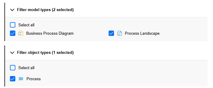
Filter model types: Expand this section to restrict the displayed news to specific model types. Select one or more model types.
Filter object types: Expand this section to restrict the displayed news to specific object types. Select one or more object types.
Example: Display a List of Model Release Workflow Content
For example, you can create a news widget that shows information about models and objects affected
by the model release workflow. Select
 Business Process Diagrams and
 Process Landscapes under Filter
Model Types and
Process Landscapes under Filter
Model Types and  Processes under
Filter Object Types. Each row in the table represents a single artefact, while the columns show
the date of the change, and the type of action performed.
Processes under
Filter Object Types. Each row in the table represents a single artefact, while the columns show
the date of the change, and the type of action performed.
Once you have configured all options, click Save to apply your settings and add the news widget to the dashboard.
Use Personal Overview Widgets
ADONIS provides several personal overview widgets that are pre-built to deliver role-based, user-specific insights. These widgets replace the personal overview dashboards that were available in earlier versions of ADONIS and are fully integrated into configurable dashboards.
Overview widgets are based on predefined data sets. While their configuration options are limited, they provide a fast and consistent way to access information that is directly relevant to your roles and responsibilities.
My Processes
The My Processes widget provides a detailed overview of processes that are relevant to you. It lists Business Process Diagrams, Process Landscapes, and Process objects for which you are assigned as Process owner, Process manager, Methodical reviewer or Process analyst/designer (properties in the chapter "Organisation").
The widget allows you to filter the listed processes by responsibility, helping you quickly focus on the areas where you are involved.
Configuration-wise, only the Title and Description of the widget can be adapted.
My KPIs
The My KPIs widget provides a detailed overview of Performance Indicators that are relevant to you.
It lists KPIs from Business Process Diagrams and Process Landscapes where you are assigned as Process owner, Process manager, Methodical reviewer or Process analyst/designer, as well as KPIs for which you are directly assigned as Responsible person (properties in the chapter "Organisation").
The widget can be filtered to focus on specific areas of responsibility, allowing you to monitor and assess KPIs that matter most to your role.
Configuration-wise, only the Title and Description of the widget can be adapted.
My Objects
The My Objects widget provides a focused overview of all repository objects for which you are assigned as Responsible person (property in the chapter "Organisation").
Configuration-wise, you can only adapt the Title and Description of the widget and restrict the displayed object types under Filter object types (default: all).
Use Built-in Queries
In addition to saved queries from the search function in ADONIS, widgets based on a search query (for example, Bar Chart, Pie Chart, Table, or Number) can also be configured using built-in queries.
Built-in queries are predefined data sets that provide commonly used views on models and objects. They are available in the Query selector when configuring a widget.
When you select a built-in query, certain widget configuration options are predefined and therefore unavailable for editing. Depending on the widget type, options such as Group by, Value, or Aggregation may be disabled.
This ensures that the widget presents the data in a consistent and meaningful way based on the selected built-in query.
The following built-in queries are available for configurable dashboards:
My Objects
This built-in query provides a quick overview of your objects. It lists all repository objects for which you are assigned as Responsible person (property in the chapter "Organisation").
This query is only available for Table and Number widgets.
My Controls
This built-in query provides a quick overview of your Controls. It lists all Controls for which you are assigned as Responsible person (property in the chapter "Organisation").
Bar Chart widgets group the Controls by Frequency of control execution, and Pie Chart widgets by Control method (properties in the chapter "General information").
My Initiatives
This built-in query provides a quick overview of your Initiatives. It lists all Initiatives for which you are assigned as Responsible person (property in the chapter "Organisation").
Bar Chart widgets group the Initiatives by State, and Pie Chart widgets by Progress (automatic) (properties in the chapter "Controlling").
My KPIs
This built-in query provides a quick overview of your Performance Indicators. The following filters are available:
My lists all Performance Indicators for which you are assigned as Responsible person (property in the chapter "Organisation").
In my processes lists all Performance Indicators in Business Process Diagrams and Process Landscapes:
- For which you are assigned as Process owner, Process manager, Methodical reviewer or Process analyst/designer (properties in the chapter "Organisation").
My & In my Processes combines both options.
Bar Chart and Pie Chart widgets group the Performance Indicators by State (property in the chapter "Details").
My Processes
This built-in query provides a quick overview of your processes. It lists all Business Process Diagrams, Process Landscapes and Process objects for which you are responsible, based on your assigned roles. The following filters are available:
All is the default filter. It lists all Business Process Diagrams, Process Landscapes and Process objects:
- For which you are assigned as Process owner, Process manager, Methodical reviewer or Process analyst/designer (properties in the chapter "Organisation").
You can focus on one of these properties by using the Process owner, Process manager, Methodical reviewer and Process analyst/designer filters.
Bar Chart and Pie Chart widgets group the processes by State (property in the chapter "Lifecycle").
My Risks
This built-in query provides a quick overview of your Risks. It lists all Risks for which you are assigned as Responsible person (property in the chapter "Organisation").
Bar Chart and Pie Chart widgets group the Risks by Likelihood, with each group showing the aggregated Value at risk value for all contained Risks (properties in the chapter "Risk assessment").
Number widgets show the aggregated Value at risk value for all Risks.
Manage Dashboards
Configurable dashboards can be edited, deleted, shared, and more.
Refresh Dashboard
To update a dashboard so that all widgets display the latest data:
- Click
 More at the top right
of the dashboard, then select Refresh.
More at the top right
of the dashboard, then select Refresh.
Edit Dashboard
To edit an existing dashboard:
On the Dashboards Page: Click
More on the dashboard
tile, and then select Configure. This opens the dashboard in edit mode.Within an Open Dashboard: Click Configure at the top left of the dashboard to enable edit mode.
Once in edit mode, the following options are available:
Rename Dashboard: Click the pencil icon next to the dashboard name to edit it.
Configure Widgets:
Add, Reposition, and Resize Widgets: Drag widgets from the widget library onto the dashboard, move them using the drag handle
at the top left, and resize
using the handle at the
bottom right.Edit Widget: At the top right of the widget, click
More, and then select
Configure to modify the
widget configuration.
RemarqueSee Create and Configure Dashboard for more information on configuring widgets.
Delete Widget: At the top right of the widget, click
More, and then select
Delete to remove it from the dashboard.
After making your changes, click Save to update the dashboard.
Clone Dashboard
You can create a copy of an existing dashboard and use it as a starting point for a new one:
- On the Dashboards Page: Click More on the dashboard
tile, and then select Clone.
A new dashboard named Copy of <dashboard name> is created.
Delete Dashboard
To remove a dashboard that is no longer needed:
On the Dashboards Page: Click
More on the dashboard
tile, and then select Delete.Within an Open Dashboard: Click
More at the top right
of the dashboard, then select Delete.
Manage Favourites for Dashboards
To add or remove dashboards as favourites:
On the Dashboards Page: Click
More on the dashboard
tile, and then select Mark as favourite or Remove from favourites.Within an Open Dashboard: Click Mark as favourite
 or
Remove from favourites
or
Remove from favourites  next
to the dashboard name.
next
to the dashboard name.
Share Dashboard
You can generate a URL for a dashboard. This way you can e.g. easily share it with your colleagues via email.
To generate a URL:
On the Dashboards Page: Click
More on the dashboard
tile, and then select Share.Within an Open Dashboard: Click
More at the top right
of the dashboard, then select Share.
Now do one of the following:
Share the URL by email. In the Add people box, start typing the username or email address of a user, and then select the one you want when you see it. If the recipient is not a user or has no email address associated, you need to enter the full email address. Add additional recipients as needed. In the Include a message box, you can add a personal message if you want. When you are done, click Share and the message will be sent.
Paste the URL wherever you need it. Click Copy to directly copy the URL to the clipboard, or copy the URL manually from the Copy link box.
Filter Dashboards
You can filter the dashboards shown on the Dashboards page by selecting an option at the top of the page:
All (default): Shows all dashboards.
Created by me: Shows only dashboards you created.
Favourites: Shows only your favourite dashboards.
Find Dashboards
To find a dashboard on the Dashboards page:
- In the Search... box, type the text you want to search for.
All dashboards that contain the search string in their name are shown.
Manage Save Location & Permissions
Dashboards are repository objects and can be managed like other objects in ADONIS:
New dashboards are stored in your personal objects folder (
Personal Objects\<username>\Dashboards).Dashboards can be moved to a different object group to change their storage location.
ADONIS administrators can assign permissions at the object group or individual dashboard level to control who can view or edit dashboards.
View Widget Data
You can explore and interact with the data displayed in widgets. The available actions depend on the widget type.
Open Saved Query
For widgets that are based on a saved query (for example, Bar Chart, Pie Chart, Table, or Number), you can open the underlying query to see or refine the dataset:
- At the top right of the widget, click
More, and then select Open
saved query.
The related saved query opens in a new window, allowing you to view the saved query and, if you are its creator, modify it.
Open Properties
For widgets based on model or object data (for example, Line Chart or Gauge Chart), you can open the properties of the related artefact.
- At the top right of the widget, click
More, and then select
Open.
The properties of the artefact open in a new window.
Interact with Charts
Charts are interactive, allowing you to explore underlying data directly from the dashboard.
Bar Charts: Click a bar to open a tabular view showing all elements in that category.
Pie Charts: Click a slice to open a tabular view showing all elements in that category. You can also click a name in the legend to toggle a slice on or off, removing or re-adding it in the chart view.
Line Charts: Click a data point on a line to open a tabular view showing the artefact whose data the line represents.
Search, Filter, and Configure Table Columns
Widgets that display data in a table, such as the Table and News widgets, provide several tools that help you find, filter, and organise data more efficiently.
Use Table Filters
You can narrow down the displayed rows in widgets that present their data in a table by using column filters.
Click the filter icon
 in a
column header to start building your filter.
in a
column header to start building your filter.Depending on the type of data in the column, select the available filter options (for example, whether all rules or any rules must be fulfilled).
To build a rule, choose an operator such as Starts with, Contains, or Equals. Then enter or select the value to filter for.
Optionally, click Add rule to include additional filter conditions.
Click Apply to confirm your filter settings.
The available filter options depend on the type of data shown in a column, for example text, selectable values, or dates. The filter dialog adapts accordingly.
Search
To search a table:
- In the Search... box, type the text you want to search for.
As you type, the table is filtered to show only rows where the search term appears.
Show or Hide Columns
To change which columns are displayed in a table:
- At the top right of the widget, click
More, select Select
columns..., and then choose the columns you want.
Group Table Entries by Type
To group the listed elements in a table by model or object type:
- At the top right of the widget, click
More, and then select Group
by type.